EVICTION LAB SITE & MAP
Visual & UI Design, Map Design, Interdisciplinary Collaboration
As design lead for Eviction Lab, I worked directly with Creative Director James Minton and UX/developer extraordinaire Lane Olson to design the responsive visual system, UI, and map experience for evictionlab.org. Initiated by Matthew Desmond, Princeton sociologist and Pulitzer Prize-winning author of Evicted: Poverty and Profit in the American City, Eviction Lab created the first national public database of eviction records accessible through a web map. Featured by The New York Times, Mapbox, and multiple news outlets, the site launched in April 2018 and has since supported new reporting on American housing, demographics, and geography while serving as a tool for journalists, citizens, researchers, and policymakers.
Mobile map view
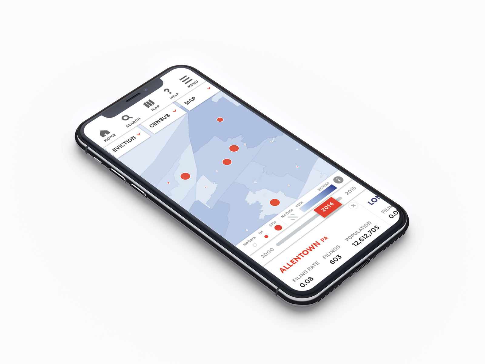
The central design challenge was translating a vast, politically urgent dataset into an interface that felt clear, trustworthy, and approachable. The map needed to display eviction rates nationwide, from states down to Census block groups, while also supporting layered Census variables, geocoding, legends, labels, boundaries, tooltips, and missing-data states.
Present desktop map view on launch
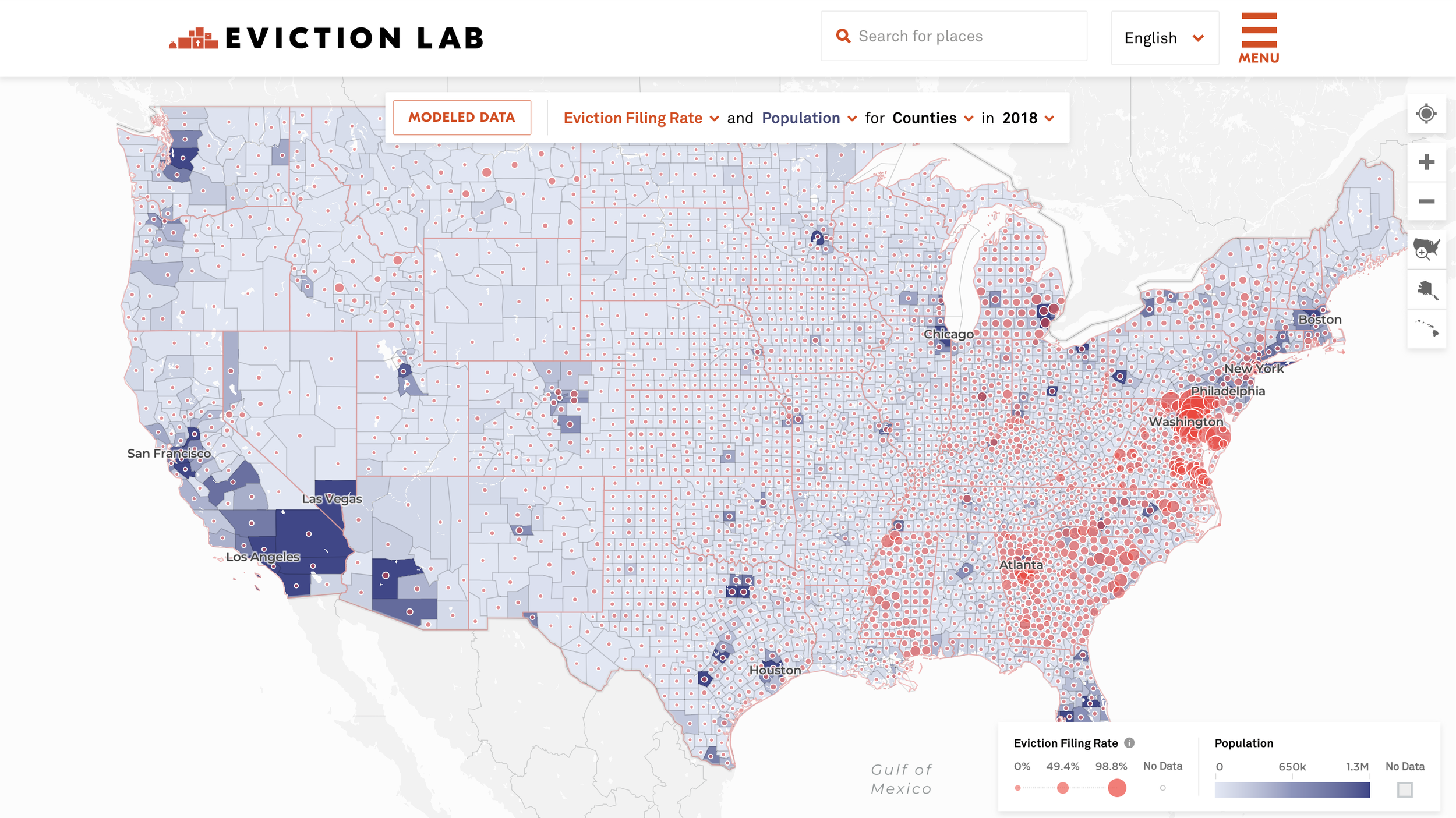
Alternate map view
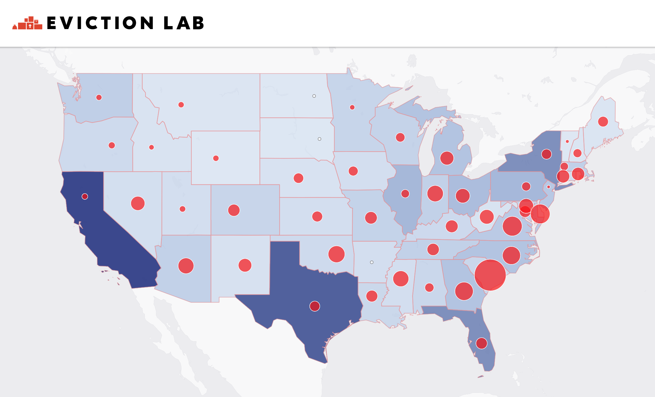
We developed a bivariate mapping strategy that paired choropleth layers for Census data with red “danger color” bubbles for eviction data, then refined the visual hierarchy so users could orient themselves geographically without losing sight of the statistics.
Map detail views
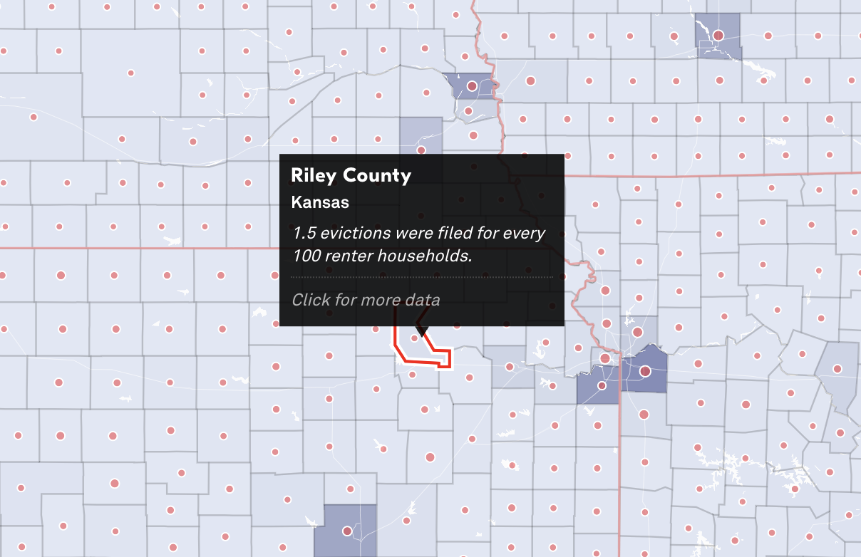
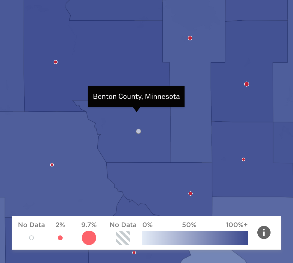
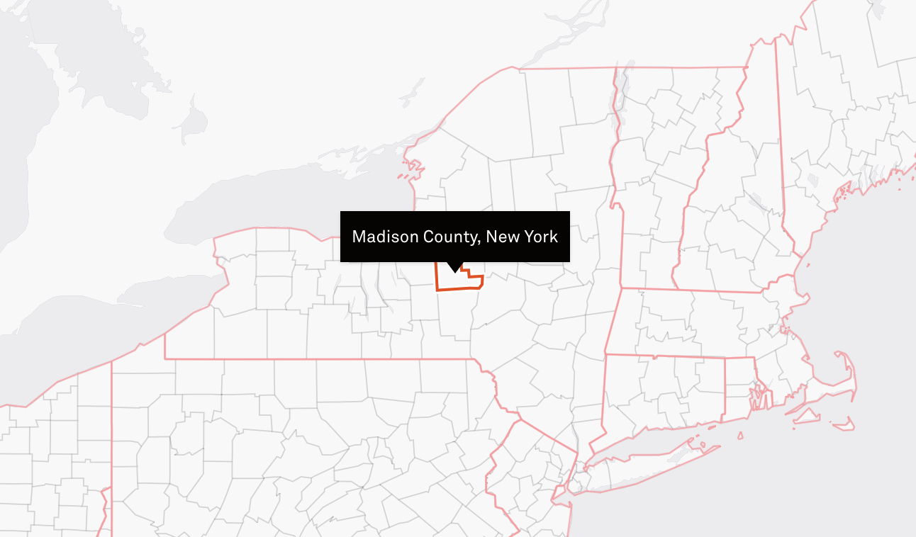
Across the site, I focused on balancing contemporary typography and an open, airy interface with accessibility and usability. Our team favored visual and textual concision, UX best practices, and a color system distinguishable by a broad range of vision-impaired users. We made deliberate decisions around zoom behavior, label density, map styling, and null-data indicators, including white bubbles with gray outlines to distinguish missing data from areas with no evictions. The resulting experience invited users to explore complex layered datasets directly; the average reported time spent with the map shortly after launch was 7 minutes and 43 seconds.
To visit the website, please click here.